The Design Was Already There — I Just Had to Look Down
I was standing at a counter in Aruba with a pastechi in one hand (hot, fried, filled), the kind of thing you eat before you have a chance to think about it — when I noticed the beer can next to me. It was called Chill. Local. Cold. And the design stopped me mid-bite.
What the Can Said Without Saying Anything
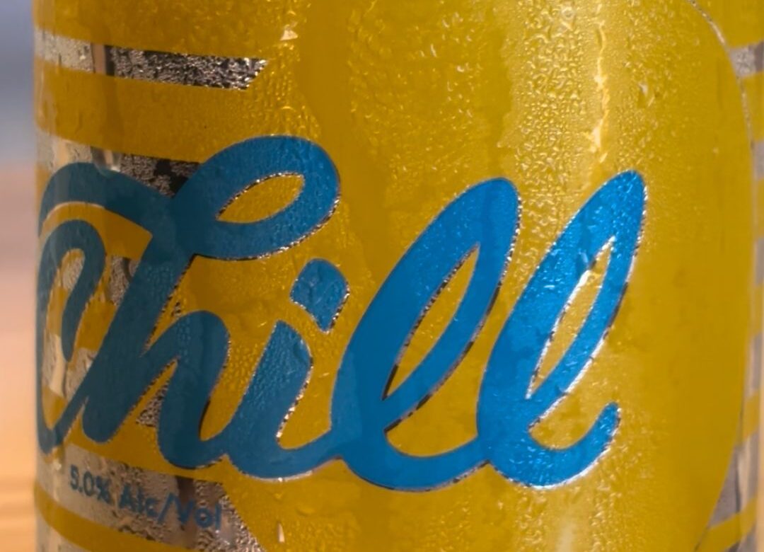
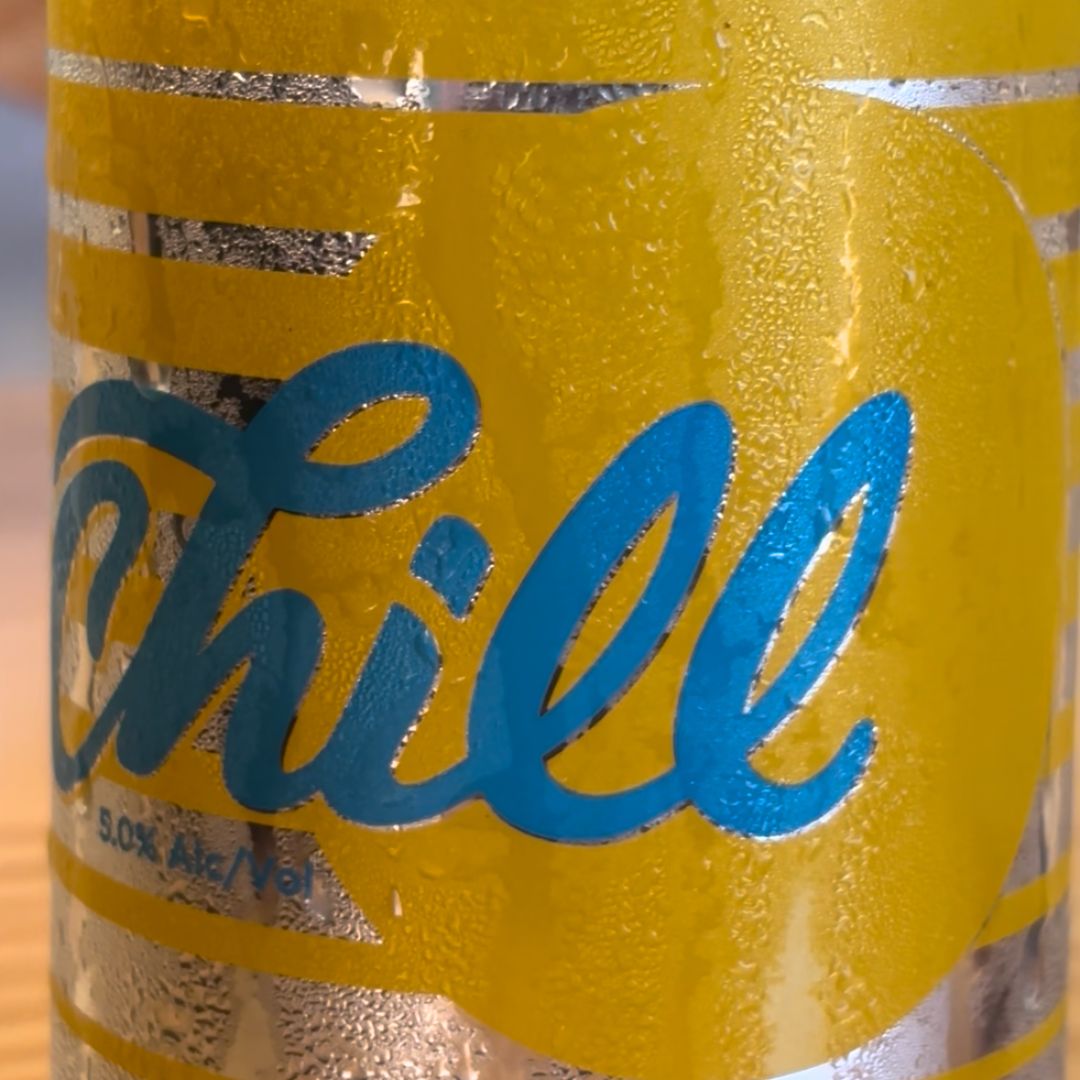
The Chill can was not subtle. That was the point. A warm, saturated gold, the colour of sand in full sun, anchored by a bold blue script logo that spills across the front with confidence. Silver horizontal lines cut through the middle, adding structure without tension.
Most beer branding defaults to cold blues and silvers, the suggestion of ice. Chill went the other direction entirely. The gold is the feeling of the place: the heat, the light, the unhurried pace of an afternoon on the beach. The blue script has weight and personality and the contrast between the two is high-impact without being aggressive. Confident without being loud.
What Travel Does to Your Eye
There is a particular kind of attention that sharpens when you are somewhere unfamiliar. You are not on autopilot. You are reading the environment, the signage, the typography on storefronts, the colour choices on buildings. Your creative eye wakes up because it has to. I still find that travel recalibrates it in ways that sitting at a desk cannot. Good design is not universal in its vocabulary. It is specific. It is local. It earns its meaning from context.
Everyday Objects as Design Education
The Chill can did not need a case study to communicate effectively. It did it in three square inches of printed aluminium. When the medium is small and the message has to land quickly, every decision is load-bearing. Colour, type, hierarchy, proportion — nothing is decorative. Everything is working. There is a discipline in simplicity that is harder to practise than complexity. Complexity can hide uncertainty. Simplicity has nowhere to hide.
A Question to Take With You
Good design shows up everywhere, on supermarket shelves, on the side of a van, on a beer can in Aruba. The question is not whether it is there. The question is whether you are paying attention.
What is the last everyday object that stopped you? What was it doing well — and what would you do differently?