Cloud Dancer: The Concerns, the Context, and the Creative Opportunity
“Cloud Dancer” is everywhere right now—on moodboards, in styling reels, in brand palettes, and across product drops. It’s soft, airy, and undeniably pretty. And like any trend that moves fast, it’s also raising a few valid concerns.
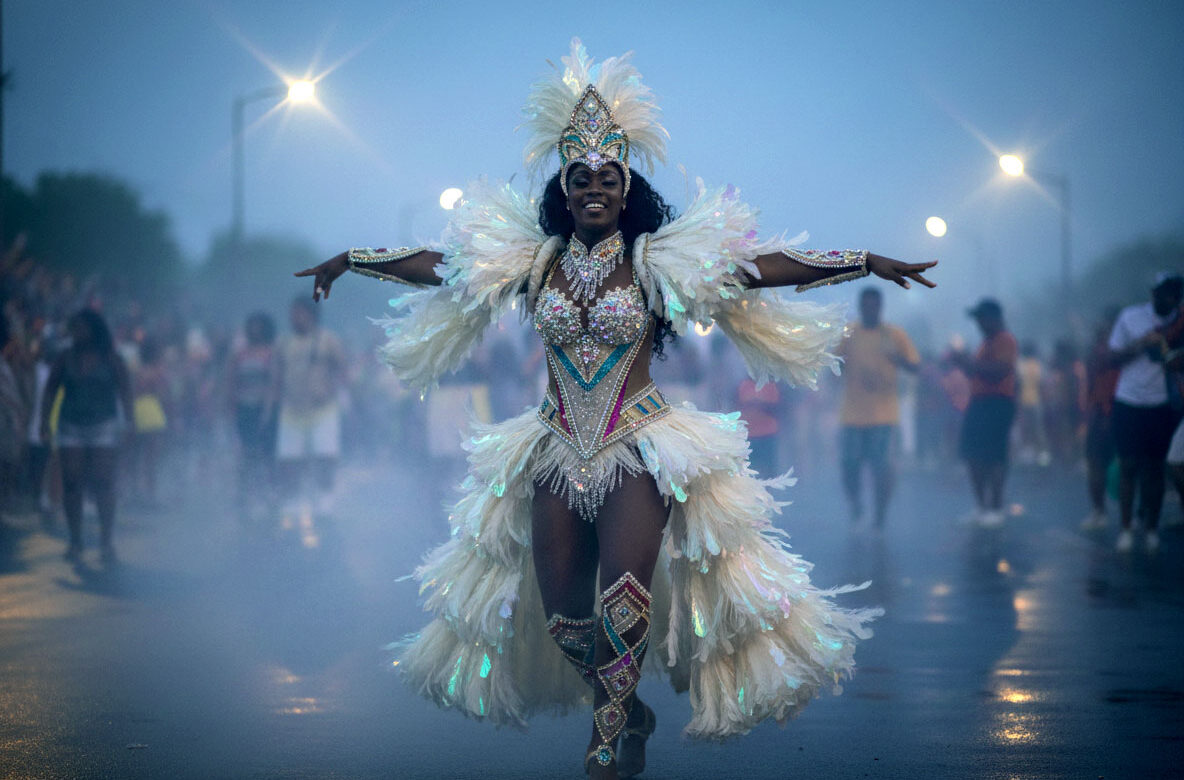
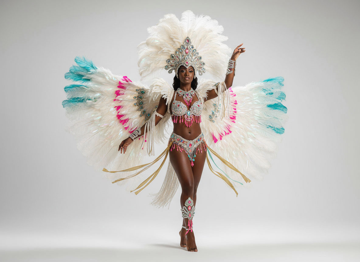
To ground this: Cloud Dancer is the Pantone Color of the Year pick—a single colour swatch that’s quickly become a visual shorthand for calm, minimalism, and “quiet luxury.”
This post isn’t here to dismiss the critique. It’s here to hold it with care—and then reframe the conversation toward what matters most: how we use inspiration responsibly, and how we turn what’s popular into something personal, culturally aware, and creatively original.
First: what is Cloud Dancer (as a colour swatch)?
As a swatch, Cloud Dancer reads as a warm, off-white with a gentle creamy undertone—an elevated neutral that feels clean without feeling stark. It’s the kind of colour that brightens a space, softens a layout, and gives brands a calm canvas for typography, photography, and texture.
It’s also become a shorthand for a certain aesthetic: minimal, curated, and highly shareable.
The real concerns (and why they’re worth listening to)
When a colour becomes a cultural moment, the conversation expands beyond paint chips and palettes. Here are a few of the most common concerns—and the deeper creative questions underneath them.
1) “Is this just another beige era?”
There’s a fatigue that comes with trends that flatten everything into the same visual language. When every brand, rental, and retail space leans into the same creamy neutral, we lose distinction.
Creative question: How do you stay timeless without becoming invisible?
2) “Does it erase personality—or culture?”
A neutral-forward aesthetic can unintentionally sideline colour stories that are rooted in culture, place, and identity. For some audiences, “clean” can read as “sterile,” and “minimal” can read as “not for me.”
Creative question: Who feels seen in this aesthetic—and who doesn’t?
3) “Is it practical in real life?”
Light neutrals photograph beautifully, but they can be high-maintenance in real spaces—especially in vacation rentals, retail environments, or homes with high traffic. Scuffs, wear, and lighting shifts can change the entire mood.
Creative question: Is the look serving the lifestyle, or fighting it?
4) “Are we using it as a shortcut?”
Sometimes a trending neutral becomes a substitute for strategy. It’s easy to default to what’s already proven to perform online.
Creative question: Are you designing for the algorithm—or for your actual audience?
Now the reframe: Cloud Dancer isn’t the problem. Copy-paste is.
Here’s the truth: Cloud Dancer can be a beautiful starting point. As long as we don’t treat it as the final answer. Used thoughtfully, Cloud Dancer can act like negative space in a gallery: it gives room for story, texture, and meaning to take the lead. It can support bold ideas instead of replacing them.
So instead of asking, “Should we avoid it?” a better question is: How do we use it with intention—and make it ours?
How to use Cloud Dancer as a stage (not a script)
If Cloud Dancer is your base, the magic comes from what you build on top of it. Here are a few ways to keep it fresh, personal, and creatively rich.
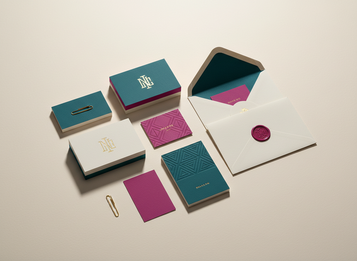
1) Pair it with a colour story that has roots
Neutrals become powerful when they’re in conversation with something specific.
- Add a saturated accent pulled from your brand’s origin story (place, heritage, community)
- Use colour in smaller, deliberate moments: trim, signage, packaging interiors, or digital highlights
- Let photography carry the colour through wardrobe, props, or environmental cues
2) Make texture do the talking.
Cloud Dancer shines when it’s layered.
- Matte + gloss finishes to create depth
- Natural materials (linen, wood grain, stone, plaster)
- Pattern that’s subtle up close but intentional from afar
In brand design, this can look like tactile print choices, paper stock, embossing, or a web layout that uses micro-texture and spacing with purpose.
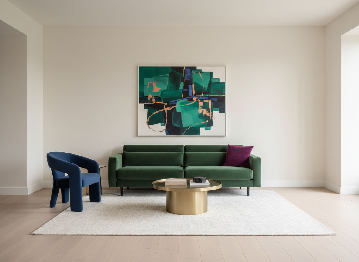
3) Use contrast to create identity
If everything is soft, nothing stands out.
- Bold typography (weight, scale, and hierarchy)
- Deep, grounded secondary colours (espresso, ink, oxblood, forest)
- High-contrast photography that feels human—not generic
4) Build a palette that’s flexible, not fragile
Especially for spaces that need to perform (rentals, retail, studios), consider:
- A “hero neutral” (Cloud Dancer)
- A slightly deeper companion neutral for durability
- A mid-tone for warmth and balance
- One statement colour that’s unmistakably you
That way, your look holds up in different lighting, seasons, and real-life wear.
5) Design beyond the feed
Cloud Dancer photographs well—great. But your brand has to live in more places than Instagram.
Ask:
- How does it feel in person?
- How does it read on signage, packaging, or a website?
- Does it support accessibility and legibility?
- Does it still feel like you when trends shift?
The takeaway: let it be the backdrop for originality
Trends are not inherently shallow. They’re signals—of what people are craving, what feels safe, what feels aspirational, what feels calm. Cloud Dancer, at its best, is an invitation to slow down and create with clarity.
So if you love it, use it. Just don’t stop there. Let Cloud Dancer be the stage for:
- your cultural references
- your bolder contrasts
- your textures and materials
- your stories
- your point of view
Because the most memorable brands and spaces aren’t built on a single colour. They’re built on intention.
Want help making it feel like you? If you’re drawn to Cloud Dancer but don’t want your brand or space to look like everyone else’s, I can help you translate the aesthetic into something distinct.

Strategy-led design and marketing solutions for brands ready to show up clearly and impactfully.
- Greater Toronto Area, CA
- hello@visibilitycreative.ca
- 4168927622

© 2026 Visibility Creative Agency | Visibility Creative Services Inc. | Privacy Policy